We have worked with The Oakridge School for nearly 10 years on all kinds of projects from their golf tournament collateral, summer programs brochure, booklets, invitations, flyers, and logo modifications. Then, almost a year ago we were invited to respond to their RFP for an opportunity to become their official Agency of Record, which would make us responsible for their admissions campaign for the entire school year. We jumped at the opportunity, and to our delight, our proposal was accepted. Design is our first love and we are happy to invest our creativity into any project, but putting together a complete campaign is every designer’s dream.
Our Methodology
We wanted to keep the amount of text minimal but include words associated with the cornerstones of an independent education: Academics, Arts, and Athletics. The background is a photo we shot of their iconic fence line – it not only provides a visually dynamic eye-line, but it represents being “inside the fence,” and it also showcases the oak tree line along the edge of campus. The ornate frame at the top holds the call to action, which literally points straight into the word cloud. Or, if your eye lands directly in the word cloud, there’s a good chance your line of sight will be directed upward into the call to action, as it springs from the center like a thought bubble.
“When you really break it down, marketing is just the psychology of getting someone to give you a moment of their focus, with the hope and possibility of something more. The only way they’re going to give you something more, however, is if something about you makes them take a second look. Something that makes them pause,” said Chris O’Neill, the CEO of Evernote, at SXSW 2018 (see our Conference Recap here).
Many private school ads heavily incorporate the school’s colors, but their signature deep navy and hunter green were getting a little bit lost in print publications, as many other schools share at least one of these colors in common with The Oakridge School. So we went in the complete opposite direction and used a sunset colored overlay, including the famed “Millennial pink” and coral (the 2019 Pantone color of the year), which really help the ad pop off the page. “It’s so different from what everyone else was doing, and that’s what we loved most about it,” said Laura Heymann of Green Apple Lane.
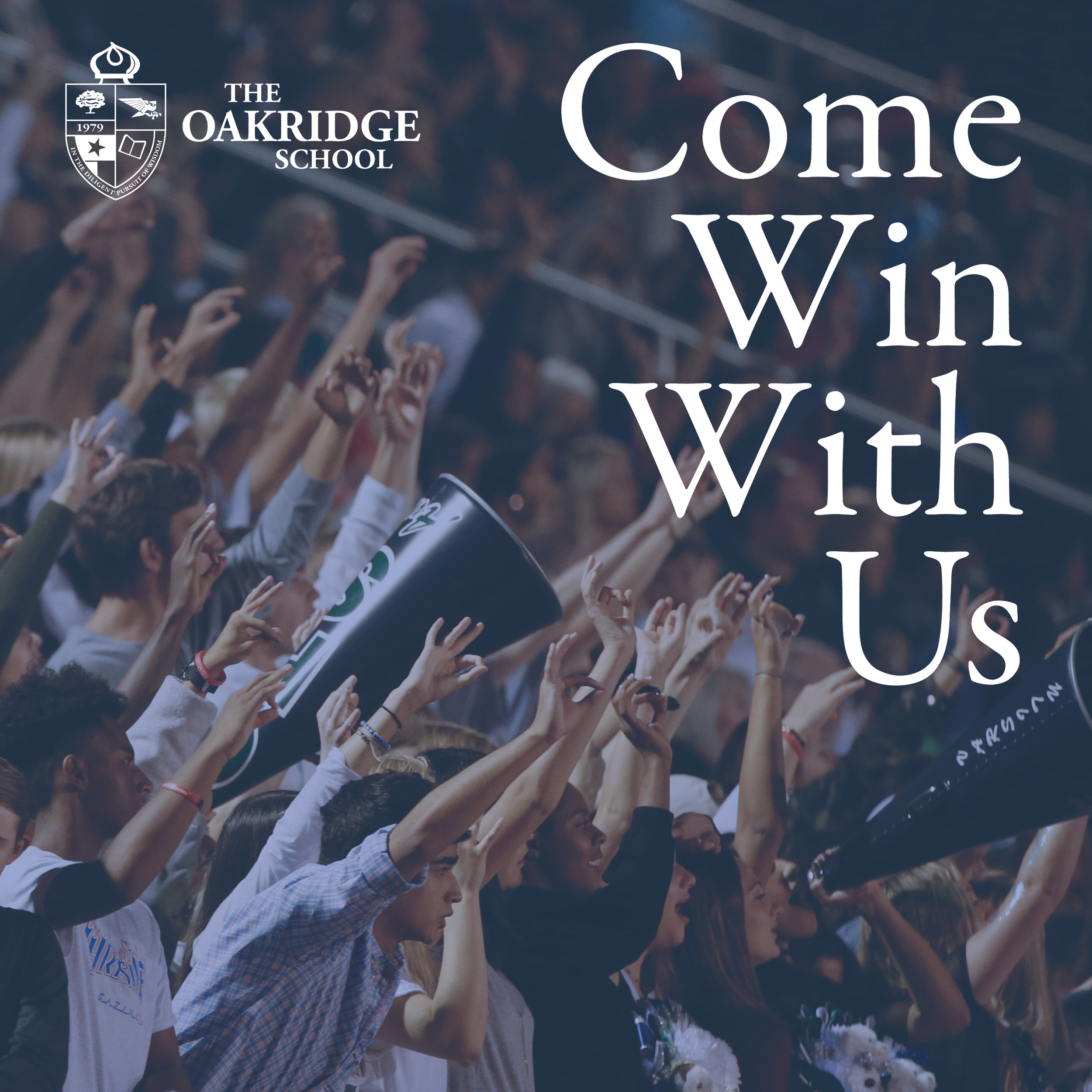
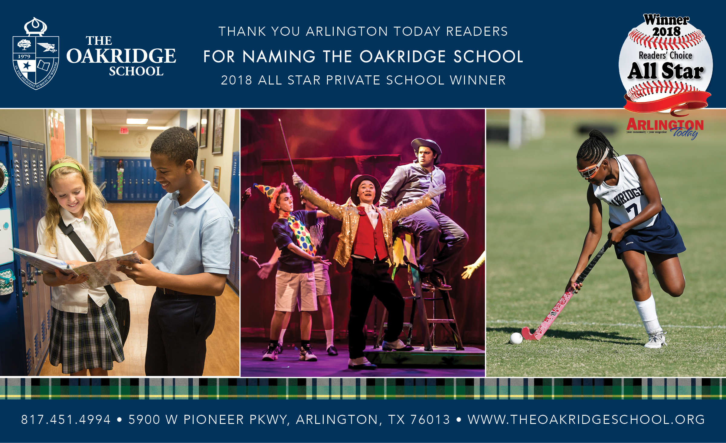
The campaign design worked well in print, online, and even fit in seamlessly with the school’s website. We isolated each word and included a photo background to correlate with that word (the art room for “create,” a cheering crowd for “win,” etc.), all accented in a blue overlay to fit right in on the existing home page carousel.
In addition to the campaign graphics, we used hard data from their web analytics to advise and make media placement recommendations for the duration of the campaign term, including a radio broadcast ad on KERA (the Dallas-area PBS and NPR station), for which we also crafted the copy.
Additional design projects
(unrelated to the campaign)
40th Anniversary (“Ruby” anniversary) logo alteration and related signage
Assorted social media graphics
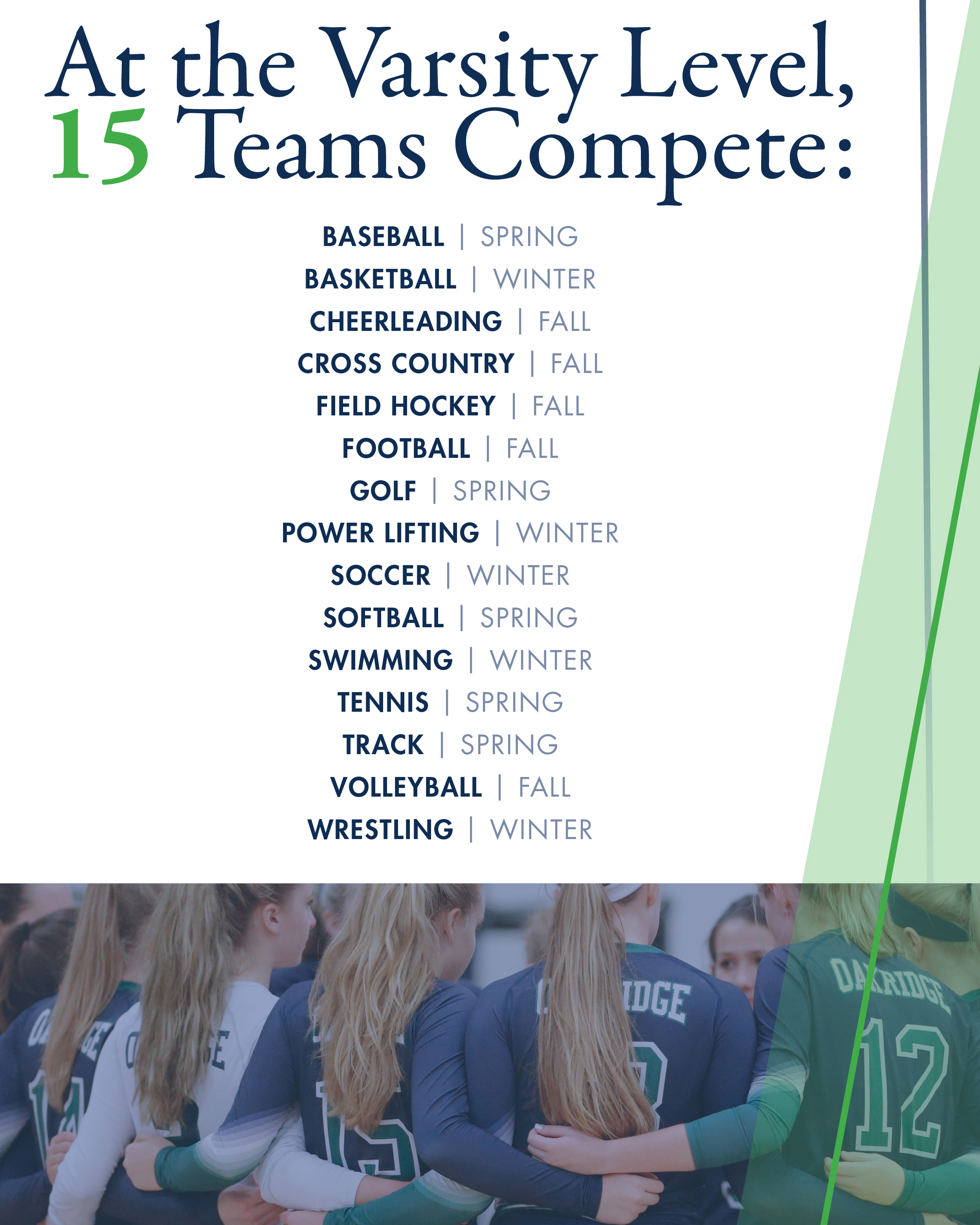
Athletics marketing piece (select panels shown)
Admissions marketing piece (not shown)
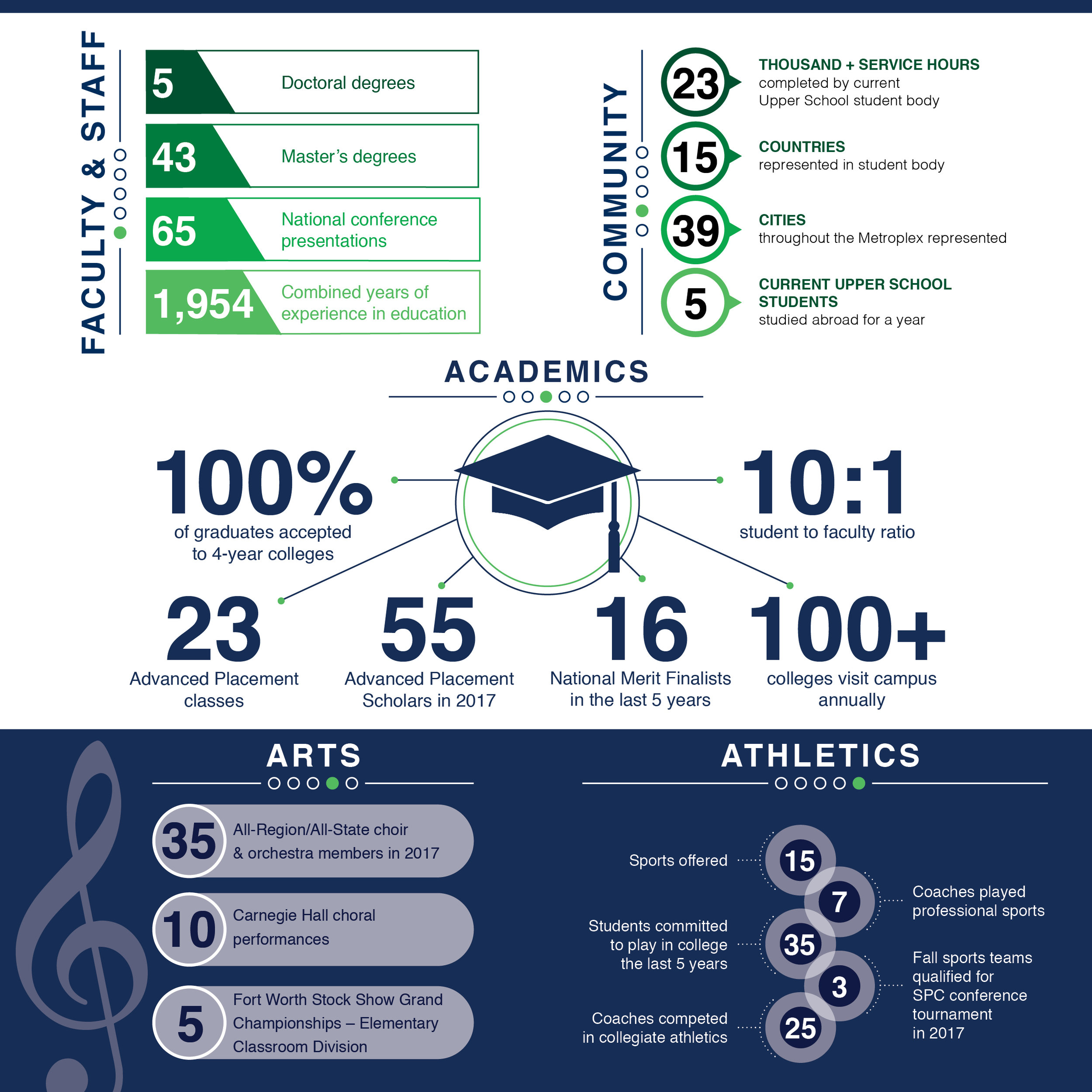
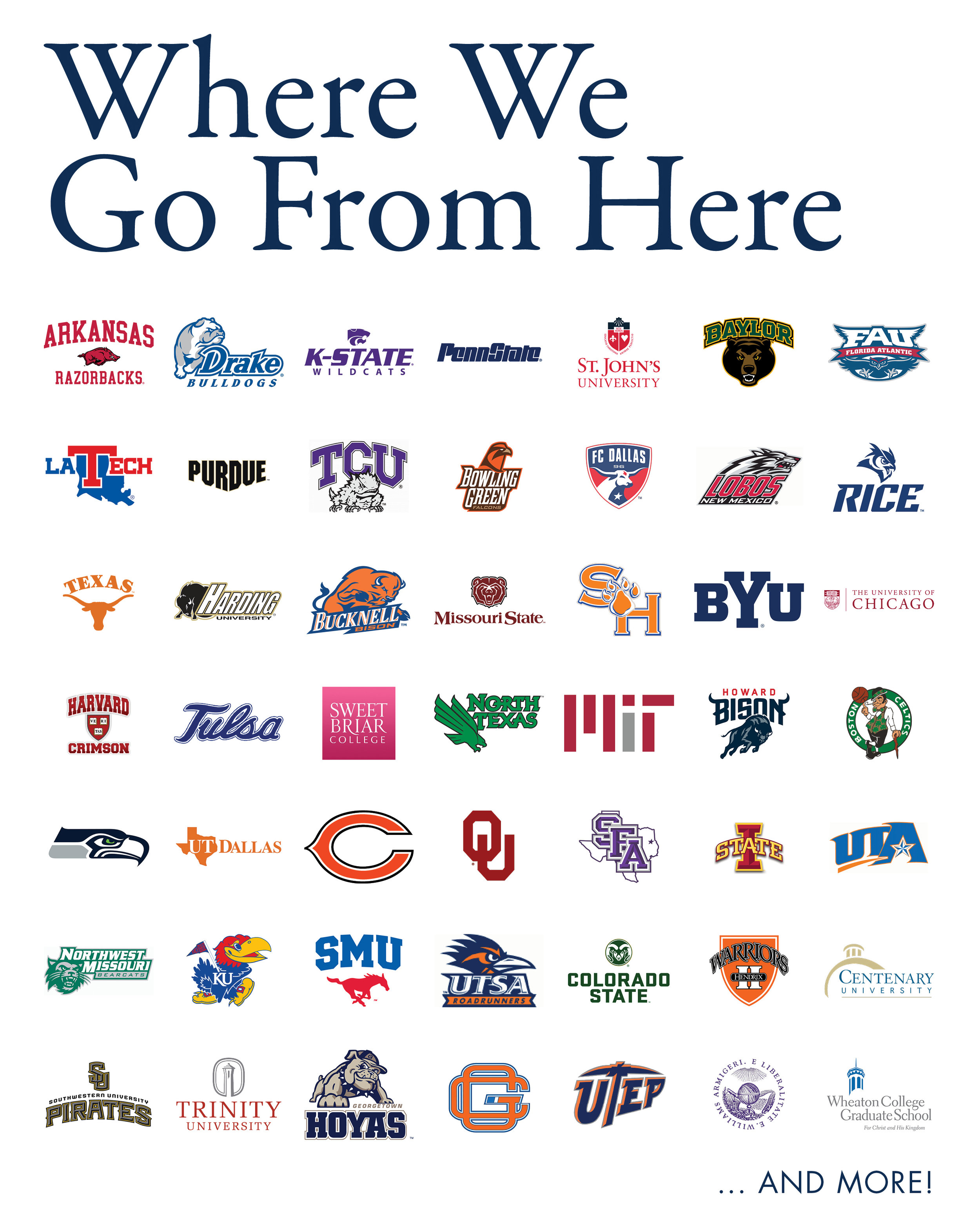
Infographic marketing pieces (select area shown)
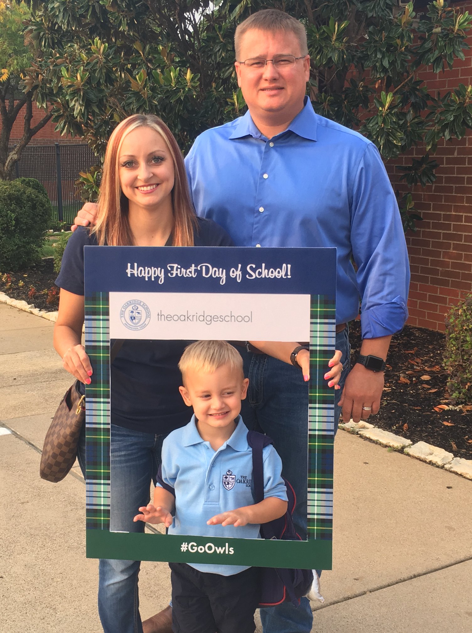
Custom “instagram photo frame” signs for various occasions, and more!
