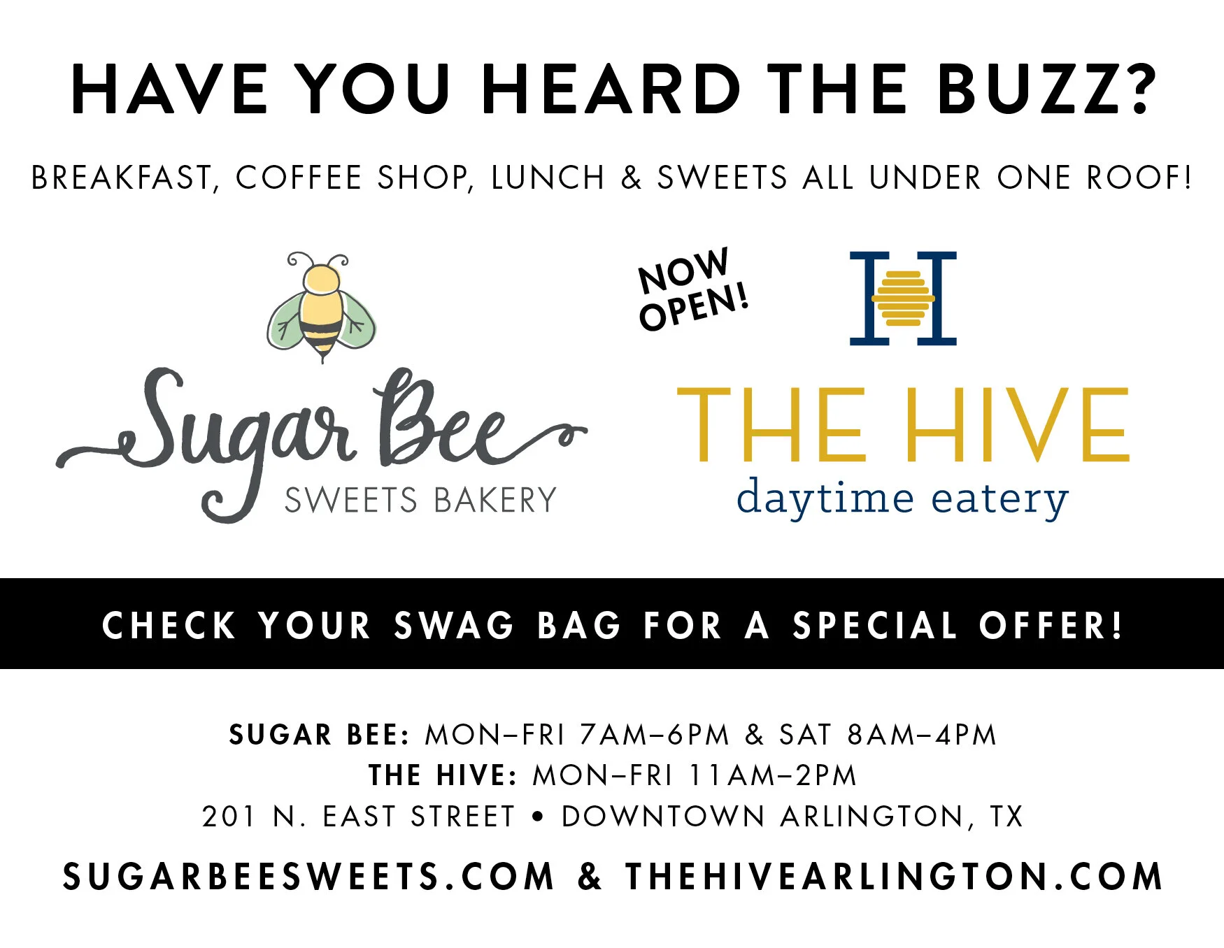
When the owner of Sugar Bee Sweets came to us with the idea for a new lunch spot called The Hive, we were over the moon excited to brand it! We started with a simple and clean logo in navy, mustard yellow, and white. We set up the ‘H’ icon to be able to stand alone as a brand mark in any combination of the three colors as well.
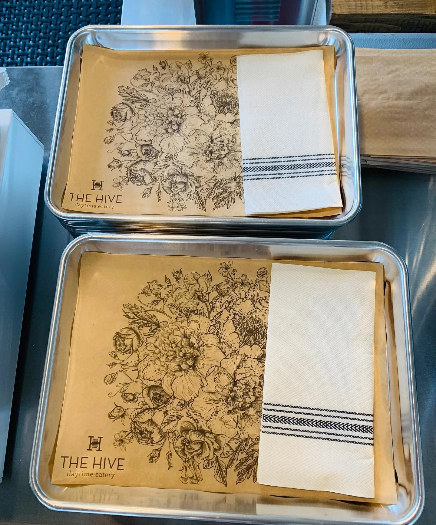
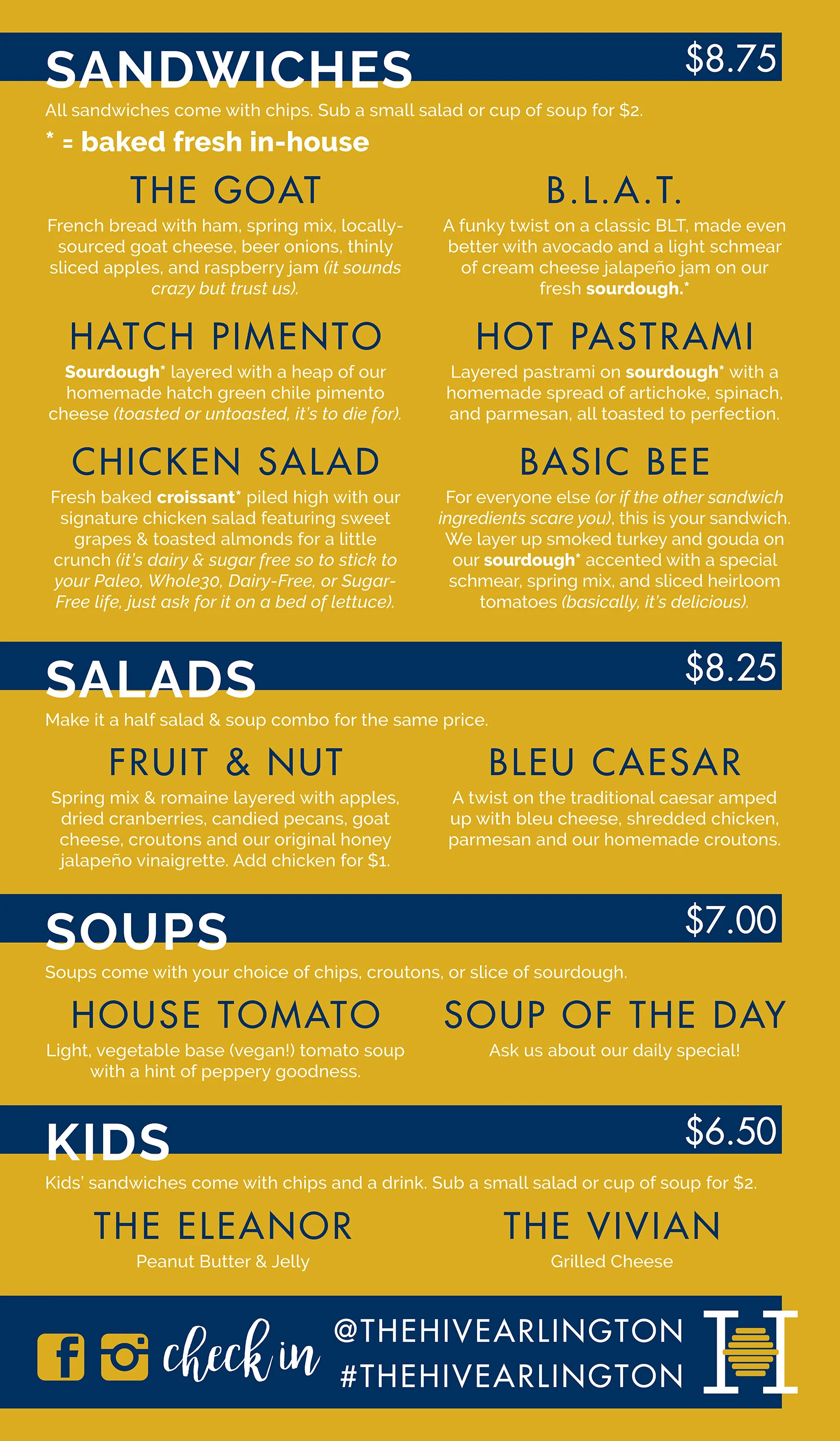
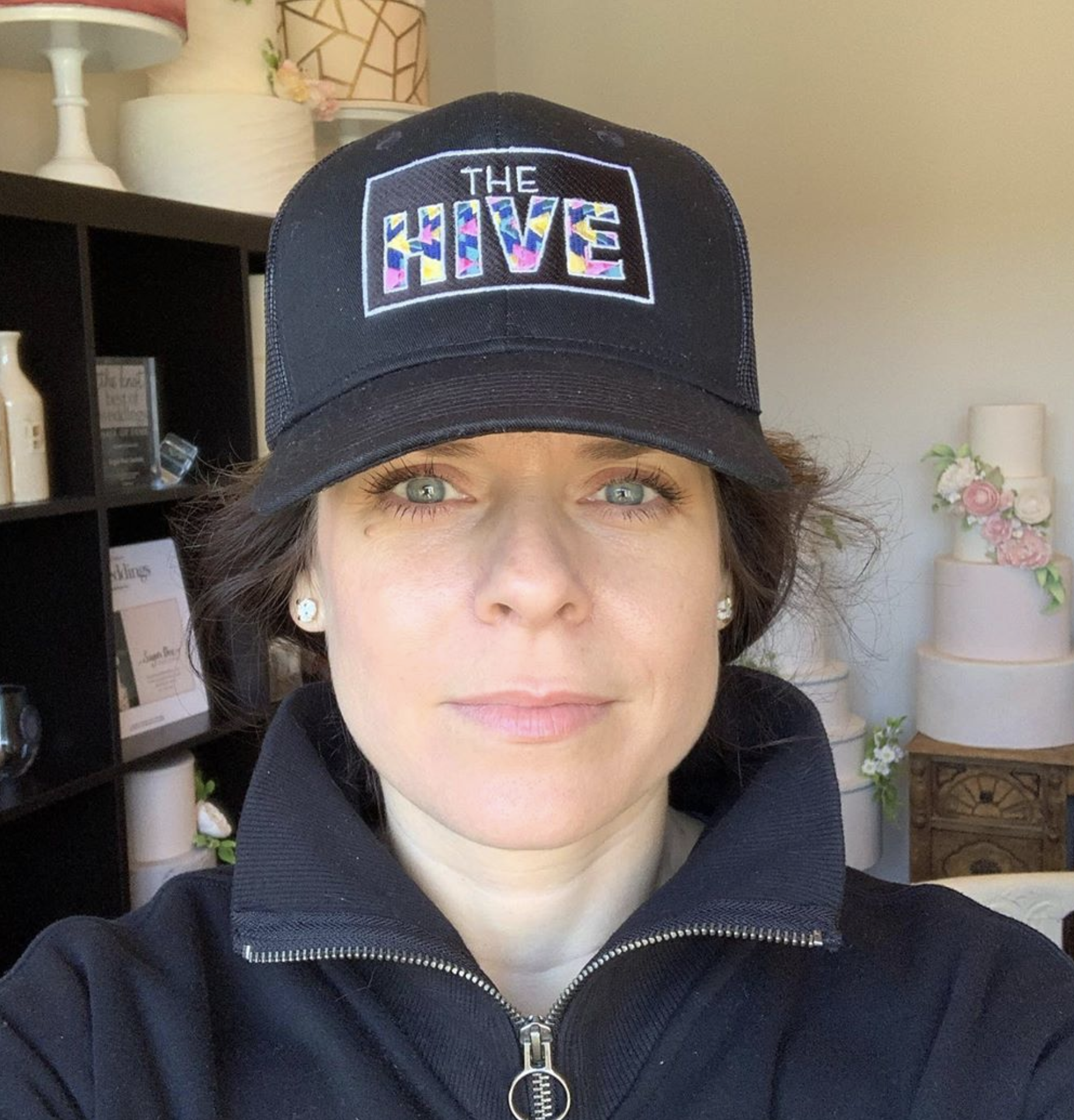
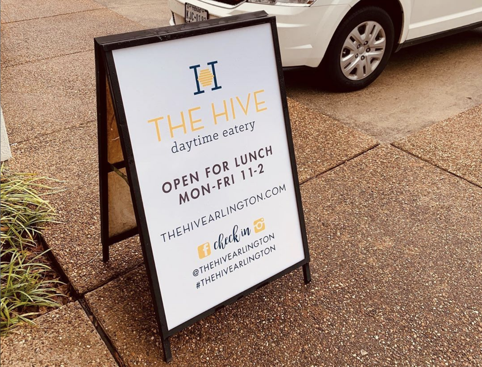
A few of our favorite pieces we've designed so far for The Hive include a floral tray liner, their website, menu, a mural of their logo and other graphic elements shown on the outside of the building (our concept flawlessly executed by Luisito Design), two embroidered hat designs, a sponsorship ad, and outdoor A-frame signage.
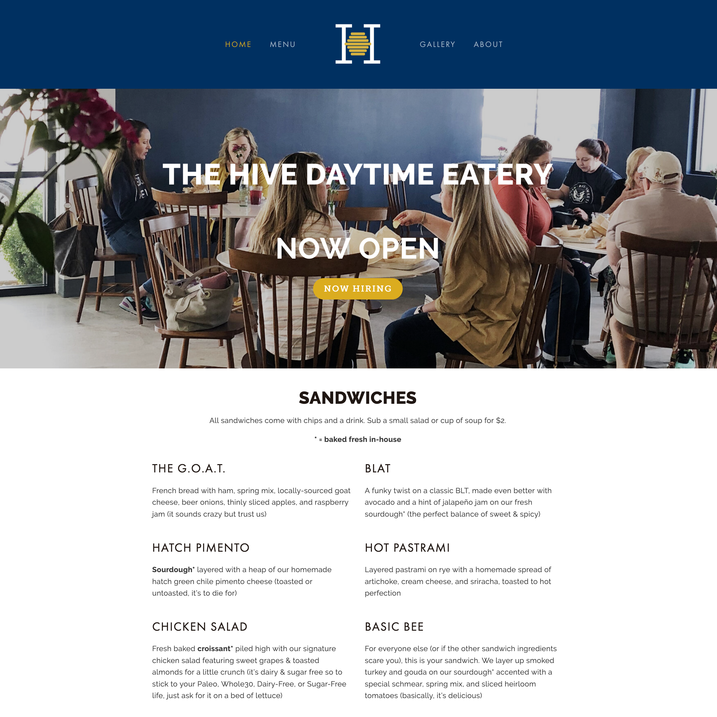
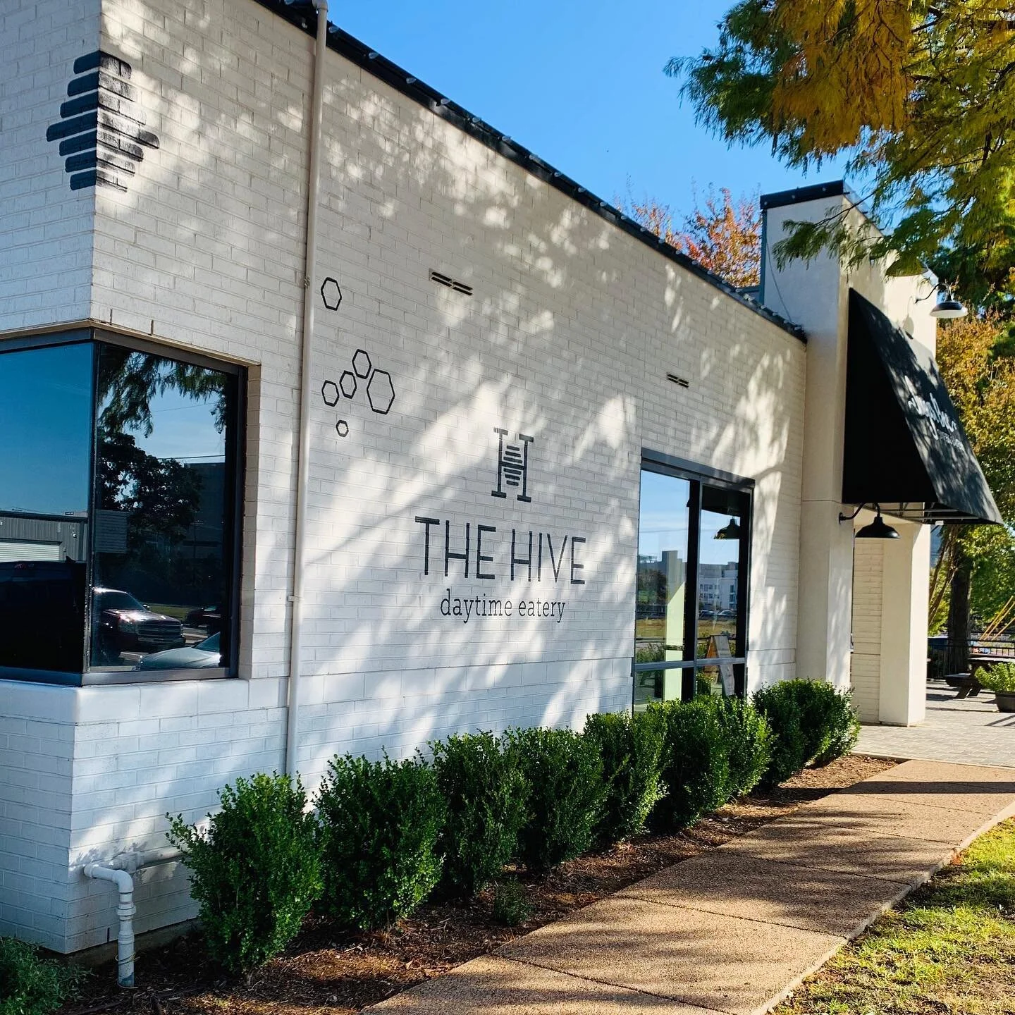
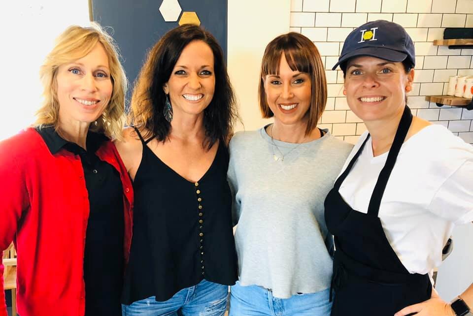
Remember from the Sugar Bee Sweets brand spotlight that the owner loves to blend masculine and feminine design elements? You’ll see that style echoed in The Hive’s decor - walls of hexagons on navy surround the tables and chairs, with a wall of air plants and a live-edge wood lunch counter across from the sandwich line, and white subway tile with black grout on the other large walls, behind the line and the drink area, which houses their large menu. The room is finished out with floral touches and ingredient packaging/overstock on open shelving. There’s even an outdoor patio to enjoy!

We’re so proud of the branding we’ve developed for The Hive, and can’t wait to watch the buzz continue to grow!